Layout and styling
Global configuration
Via Admin > Configuratie > Algemene configuratie, section Organization configuration, you can configure the look and feel of the forms and html-email.
- Organization name
The organization name is used in link labels and document titles for accessibility reasons. You can override this on individual themes.
- Main website link
The main website link is used so the end-user can return to your main website, e.g.
https://www.gemeente.nl. Clicking the logo (or link) in the header will return the end-user to this URL (this can be more specific and set at the theme level too).- Favicon
You can upload your own favicon, typically displayed on the browser tab. You can override this on individual themes.
- Default theme
Open Forms supports configuring multiple themes. In the event that no explicit theme is provided for content, the default theme (if set) is used.
Added in version 2.5.0: Support for multiple themes was added.
Themes
A theme is a collection of styling/appearance configuration. It is applied to the web interface of a form, the confirmation email and the generated PDF with the submission data.
Themes can be configured via Admin > Configuratie > Thema’s. The customizable aspects are:
- Organization name
The organization name is used in link labels and document titles for accessibility reasons. You can also configure this globally (see above). When this is configured on both the theme and global level, the theme gets priority.
- Main website link
The main website link is used so the end-user can return to your main website, e.g.
https://www.gemeente.nl. Clicking the logo (or link) in the header will return the end-user to this URL. You can also configure this globally (see above). When this is configured on both the theme and global level, the theme gets priority.- Favicon
You can upload your own favicon, typically displayed on the browser tab. You can also configure this globally (see above). When this is configured on both the theme and global level, the theme gets priority.
- Logo
You can upload a logo to be used in the header here. If no logo is uploaded, a plain link will be shown. Logos can be the usual image formats, or an SVG image.
- Theme CSS class name
You can specify a CSS class name to apply to the root
htmlelement here. Typically you need this if you use an NL Design System design token package which emits the design tokens under this class name scope.Example value:
<gemeente>-theme.The NL DS theme switcher source code contains a list of built in themes and their class names.
- Theme stylesheet URL
If your organization publishes their design tokens as a package, you can use the resulting CSS file here by specifying the URL to the hosted stylesheet.
The NL DS theme switcher source code contains a list of built in themes with available hosted stylesheets under the
hrefkey.Note
If you are specifying an externally hosted stylesheet, then it will be blocked by default by the Content-Security-Policy (CSP).
Navigate to Admin > Configuratie > Csp settings and add an entry to put this stylesheet on the allowlist. For the directive field, select
style-src, while the Waarde field should contain the (base) URL of the stylesheet, e.g.https://unpkg.com/@gemeente-denhaag/.Note
This configuration option is not supported in the HTML e-mail styling, please use the “design token values” for that instead.
HTML e-mails have notoriously bad CSS support - this limitation is unfortunately outside of our hands.
Design token values
With the design token values, you can control aspects such as back- and foreground colors in the skeleton. This is considered advanced usage, as the structure from style dictionary is used.
All available design tokens can be consulted by opening the design token editor. As long as you use the default Open Forms theme, all tokens are optional and have default values.
Todo
Update e-mail to use design tokens from CSS file -> figure out if we can source a resolved JSON instead?
Refactor
openforms.emails.context._get_design_token_valuesto be a template tag instead, e.g.{% design_token 'of.page-header.bg' default="#ffffff" %}which takes into account the entire resolution.Optimize design tokens similarly to
manifest.jsonso that it’s kept in memory? This avoids network lookups (only update this when the config in admin changes) and even avoids file IO to build the resolved dictionary. We could include style-dict in the container image for this perhaps, but that requires NodeJS to be present… possibly set up a dedicated service for this.
Design token values examples
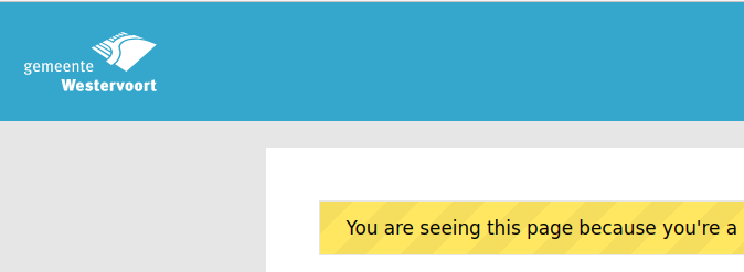
For ‘inverted logos’ it is possible to change the background colour of the header. The design token values have to be set to:
{
  "utrecht": {
    "page-header": {
      "background-color": {
        "value": "#35a7cc"
      }
    }
  }
}
This gives:
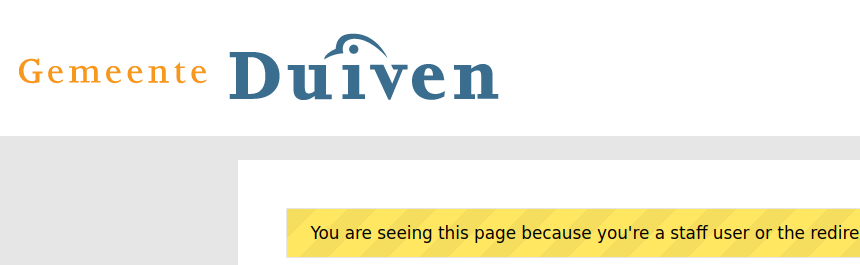
For wider logos, it is possible to increase the size with the following design token values:
{
  "of": {
    "header-logo": {
      "width": {
        "value": "400px"
      },
      "height": {
        "value": "75px"
      }
    }
  }
}
Which gives:
Color presets for rich text content component
Via Admin > Miscellaneous > Text editor color presets you can manage the shared color presets palette used by the rich text editor of the content-component.
You can freely add, change or remove presets to create a collection of consistent colors for use in free text. These are then available here:
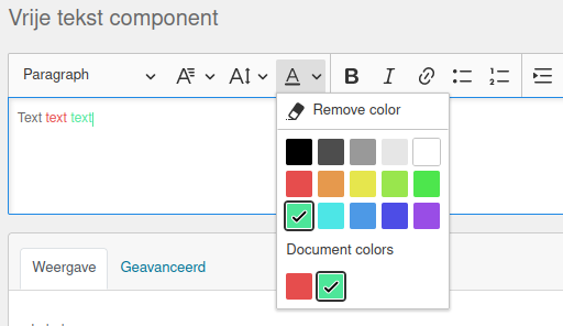
Note
Changing the presets doesn’t change text with previously applied colors.